Your Google Analytics can tell you that 2,400 people visited your pricing page last month. What it cannot tell you is that most of them clicked the logo in the top-left and bounced straight back to the homepage, completely skipping the “Start free trial” button you spent three weeks arguing about. That is the gap website heatmap click analysis fills, and it is a surprisingly wide one.
What the colours are actually telling you
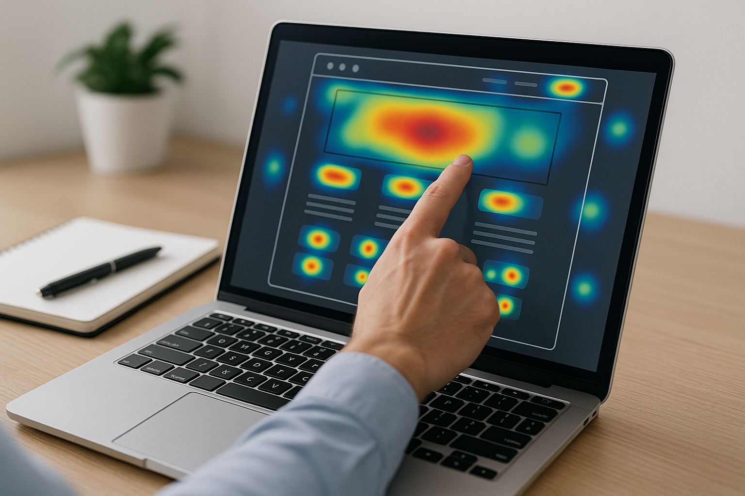
A click heatmap overlays your page with a colour gradient: warm reds and oranges where clicks concentrate, cooler blues where almost nobody bothers. The reading is intuitive enough, but the interpretation is where most people go wrong. A red hotspot is not automatically good news. Heavy traffic on an element can indicate confusion just as easily as enthusiasm, users clicking your hero image repeatedly because they expect it to be a link are not engaged; they are stuck.
The more instructive signal is usually the cold zone. If the section you built around your strongest value proposition sits in cool blue, it almost always means one of two things: the content is hard to scan, or it sits further down the page than most visitors ever reach. Either way, something designed to convert is being ignored, and that is a problem you can fix once you can see it.
The patterns worth acting on
Tools like Hotjar (now part of Contentsquare), Crazy Egg, Mouseflow, and Microsoft Clarity each record where every click lands, then aggregate that across hundreds or thousands of sessions. Once you have enough data, three patterns tend to appear with clear, practical implications for layout.
- Clicks on non-clickable elements. When visitors repeatedly click a product photo, a section heading, or a decorative banner that does nothing, they are showing you what they want to do. You can either make those elements interactive or redesign the page so the actual clickable path is harder to miss. Visitors who click several dead spots in a row and then leave are, in a sense, telling you exactly where the conversion died.
- A secondary element outperforming your primary CTA. If a blog link in your navigation is collecting more clicks than the “Book a demo” button below your headline, your visual hierarchy is not doing its job. The fix might be as simple as adjusting contrast, padding, or position, but you would never know to look without the click data.
- Attention pooling around the wrong content. Scroll heatmaps paired with click data sometimes reveal that users are reading a long block of body text intensely, hovering and clicking words, whilst your actual conversion element sits abandoned below. That usually means the copy is doing interesting work but not pointing anywhere useful, which is a structural problem rather than a copywriting one.
One mistake that undermines most analyses
Aggregating desktop and mobile visitors into a single heatmap view is one of the more reliable ways to mislead yourself. Mobile users scroll differently, tap differently, and their thumbs naturally land in different zones of the screen to a desktop cursor. A layout decision based on blended data can optimise confidently for an audience that does not really exist. Always split the view by device before drawing conclusions, and if mobile accounts for the majority of your traffic, treat the mobile heatmap as the primary document.
From data to decision
Treat the data as evidence for a hypothesis rather than a verdict in itself. Seeing that your CTA gets few clicks is an observation; understanding why requires pairing the heatmap with session recordings, which show individual journeys, or with a scroll map, which tells you whether visitors are even reaching the CTA at all. The combination of those three views gives you a causal story rather than a mystery.
Once that story is clear, test one change at a time. Move the button, rewrite the heading above it, or remove the competing element stealing attention, but not all three at once, or you will never know which fix did the work. Heatmaps are most valuable when they feed a disciplined A/B testing cycle, because that is when colour-coded intuition gets turned into a repeatable understanding of what your specific audience actually responds to.
Frequently Asked Questions
How many sessions do I need before my heatmap data is reliable?
Most practitioners suggest at least 200 to 300 sessions per page before making layout decisions, and 500 or more for high-stakes changes like redesigning a checkout flow. Fewer sessions can produce patterns that are simply random clustering rather than genuine behaviour.
Does a high-click area always mean that element is working well?
Not at all. Clicks on non-interactive elements, or rapid repeated clicks sometimes called rage clicks, usually indicate frustration or confusion rather than engagement. Always cross-reference click data with conversion outcomes to tell the difference.
Which pages should I prioritise for heatmap analysis?
Start with your highest-traffic pages and the pages that sit at key conversion points: landing pages, pricing pages, and any page with a primary call to action. Small layout improvements there tend to have an outsized effect on overall conversion rate.